Styling
Once an element is selected, the style panel opens. Change a value and it's applied to the page right away, so you can fine-tune while watching the fix on the real screen.
Style panel sections
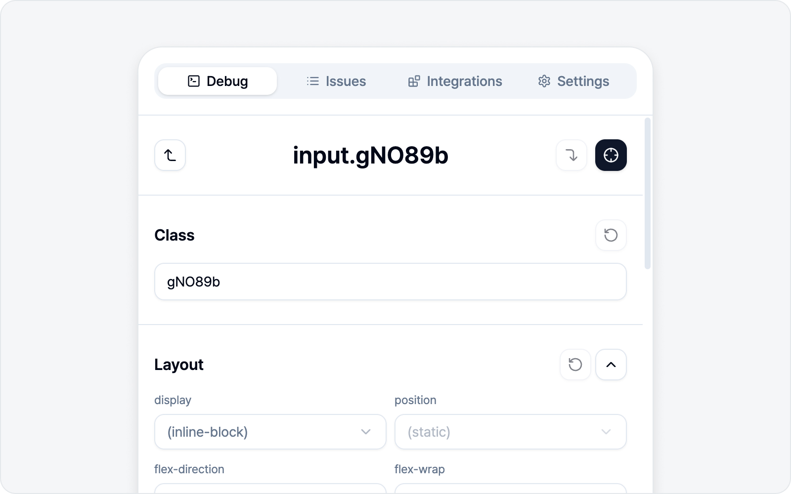 Style panel sections
From top to bottom, the panel is organized into these sections (labels show in English on screen).
- Class — Edit the element's class list.
- Layout — display, flex alignment, margin, padding, gap.
- Position — position (layout mode), z-index (stacking order), and offsets (top, right, bottom, left). Switch position to relative, absolute, and so on, then nudge the element with the four offsets.
- Container — background, opacity, border radius.
- Border — border width, color, and style. Adjust each of the four sides (top/right/bottom/left) on its own, or link them to set all at once.
- Size — width, height, and min/max.
- Overflow — overflow, white-space, text-overflow.
- Text — Edit the element's text content (shown only for elements with text).
- Typography — font size, weight, line height, letter spacing, align, color.
- Effects — shadow, filter, blend.
- Transition — transition property, duration, easing.
Live preview and reverting
- Changing a value applies it to the page immediately.
- Each section can revert just its inline changes, and there are buttons to revert Class or Text to the original — so feel free to experiment.
- To turn off a style the site itself applies, pick
unsetfrom a dropdown. Where reverting only cancels your own edit,unsetsays "this style should not apply." For example, when ellipsis (text-overflow) is clipping text where it shouldn't,unsetturns it off so you can show the fixed version.
Edit four sides together — or separately
Properties with four sides (or corners, or two directions) — margin, padding, gap, Border, corner radius, and Position offsets — have a small link button next to their inputs. It decides whether the sides move as one value or get tweaked individually.
- When the link is on, the inputs collapse into one. Type a value once and all four sides match it — no need to fill in four separate boxes in a narrow panel.
- Turn the link off and the top/right/bottom/left boxes fan back out, so you can give each side its own value.
- Turn the link on while the sides differ, and the merged box reads Mixed. No worries — your existing values aren't overwritten; the four sides only unify once you type a new value.
Design token (CSS variable) awareness
When a value — color, spacing, font, and so on — is set via the site's design tokens (CSS variables), BugShot recognizes them automatically. The value field gathers the tokens in the same family, so instead of typing in an arbitrary color or number, you can switch to a sibling token within the design system your team already uses.
For example, if a color is set to --color-primary, you can pick another token in the same family — --color-danger, --color-success — and apply it right away. For teams on a design system, the change you propose lines up with the real code from the start.
Review changes
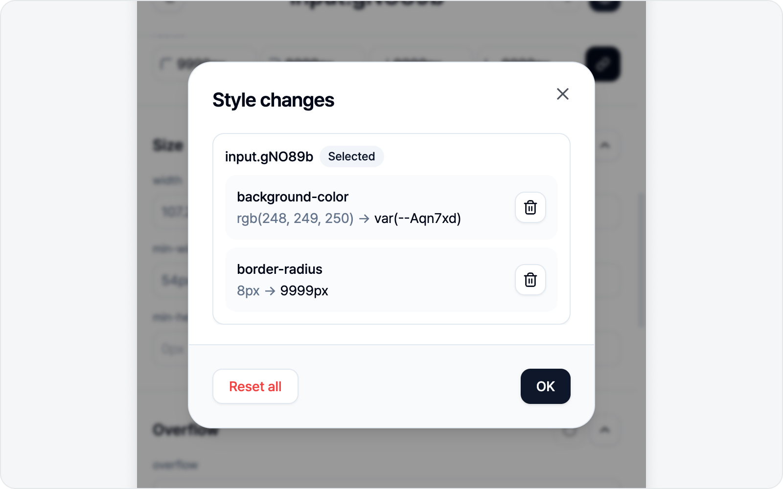 Review changes dialog
Lost track of what you've changed? Hit the Review changes button at the bottom of the panel. The number beside it is how many changes you've made so far — and if you haven't changed anything, the button stays disabled.
Open it and a dialog lists your edits grouped per element, each shown as before → after. You'll see the element you have selected now, plus any you buffered earlier (see More than one element in one issue below).
- Reset this change (trash icon, right of each row) — rolls back just that one item to its original value. The page and style panel update right away. Reset the last item on an element and that element's card disappears entirely.
- Reset all (bottom left) — rolls back every change across all elements (this one asks for a quick confirmation).
Row resets run instantly without asking, so tidy up with peace of mind. Once nothing is left to revert, the dialog closes on its own.
AI Styling
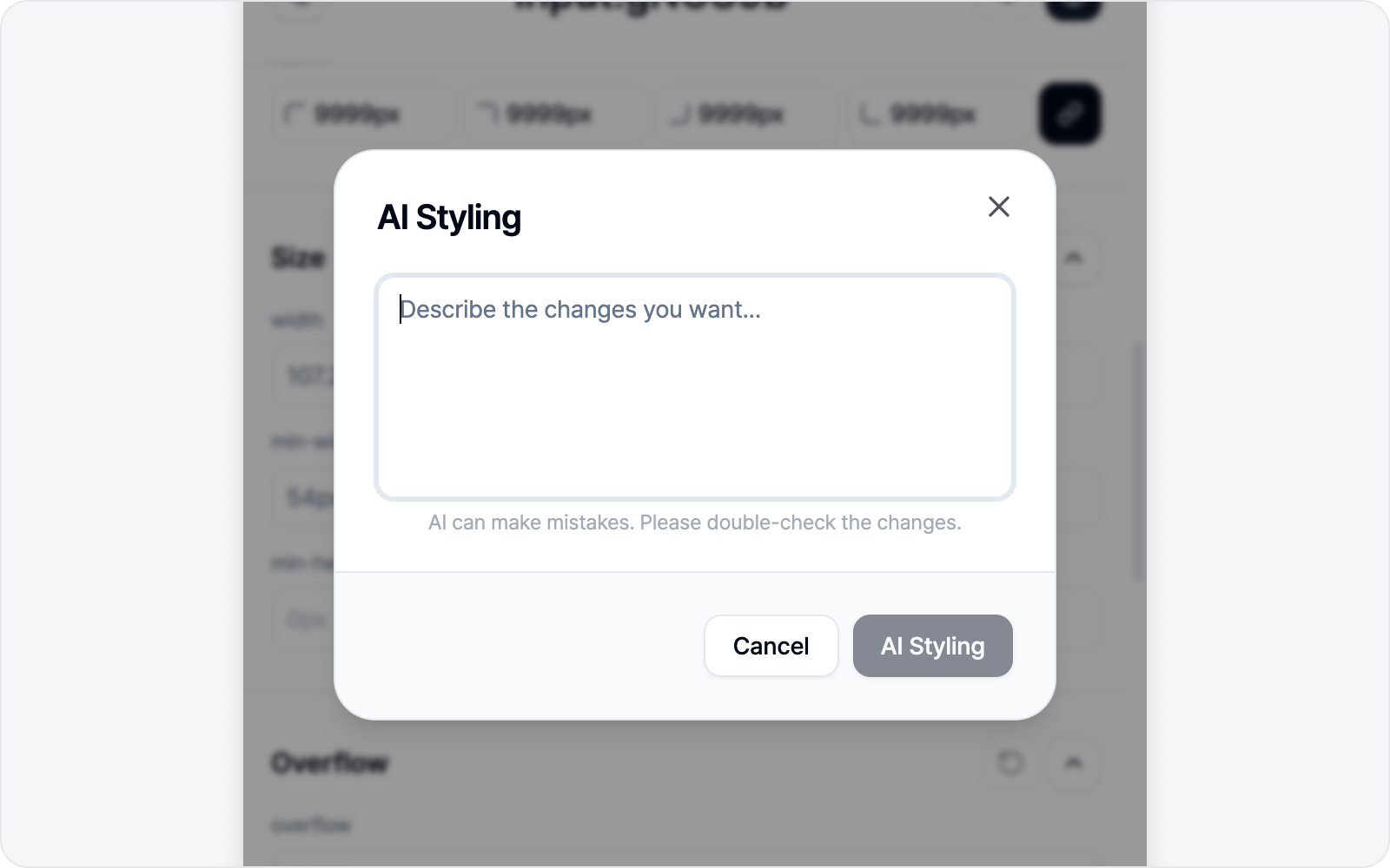 AI Styling banner
With an AI (LLM) connected, an AI Styling banner appears in the panel. When touching values by hand feels like a chore, just describe what you want.
- "Make the button rounder"
- "Add more spacing"
- "Bigger, bolder text"
AI finds the right style/class changes and applies them to the page instantly. Without an AI connected, this banner doesn't appear.
See AI LLM Connection for how to connect. AI slips up now and then, so give the applied result a quick look.
More than one element in one issue
Bugs rarely sit in just one spot. Sometimes you want to bundle several elements — "the button color + the label alignment next to it + the card padding" — into a single issue.
Fixed element A? Click Pick another element (top right) and grab the next one (B). A's changes stay on the page instead of disappearing, and they ride along into the issue too. Keep going for A, B, C… as many as you like — before/after is recorded per element.
Buffered elements show up in Review changes, grouped per element, where you can pull out individual items (remove every item on an element and the whole element drops out). To clear everything at once, hit Reset all, or just cancel the draft or finish submitting.
Next step
When you're done editing, click Next to move to the issue draft. The before and after are captured as a comparison.
Next is enabled once at least one style has changed (if you've already buffered an element, you can move on without changing the current one). To include an element as-is (without style changes), use Capture element instead.